[cherry_paralax_image bg_image=”http://www.dgxsrl.com/wp-content/uploads/2015/11/page2-parallax-img.jpg”]
[cherry_row type=”fixed-width”]
[cherry_spacer size=”50″]
[cherry_col size_xs=”12″ size_sm=”12″ size_md=”6″ size_lg=”6″]

[cherry_spacer size=”-85″ class=”sm_none”]
[/cherry_col]
[cherry_col size_xs=”12″ size_sm=”12″ size_md=”6″ size_lg=”6″]
SVILUPPO SITI WEB E APP PER MOBILE, TABLET E DESKTOP
[/cherry_col]
[/cherry_row]
[/cherry_paralax_image]
[cherry_row type=”fixed-width”]
[cherry_spacer size=”35″]
[cherry_col size_xs=”12″ size_sm=”12″ size_md=”6″ size_lg=”6″]
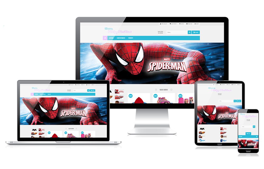
Siti Web Responsive Web Design
Il layout grafico di un sito web è molto importante perché guida l’utente nelle operazioni da svolgere e in più cattura la sua attenzione, in modo tale che non abbandoni rapidamente la navigazione del sito web prima di aver trovato ciò che cercava. Al giorno d’oggi con l’avvento delle nuove tecnologie mobili e del 4G, il popolo di internet si muove più su tablet e smartphone che con i computer, come dimostrato dal grafico sotto riportato, per questo è di fondamentale importanza avere un sito web studiato e progettato sia per i computer che per i dispositivi mobile (RSWD).
Gli standard tecnologici che utilizziamo per lo sviluppo di un sito web responsive sono il W3C, CSS3, HTML5 con particolare attenzione al posizionamento On-Page dei contenuti sia statici che dinamici.
[/cherry_col]
[cherry_col size_xs=”12″ size_sm=”12″ size_md=”6″ size_lg=”6″]
[cherry_spacer size=”45″]
[/cherry_col]
[/cherry_row]
[cherry_spacer size=”25″]
[cherry_paralax_image bg_image=”http://www.dgxsrl.com/wp-content/uploads/2017/04/servizi-parallax.jpg”]
[cherry_row type=”fixed-width”]
[cherry_spacer size=”110″]
[cherry_col size_xs=”6″ size_sm=”4″ size_md=”3″ size_lg=”3″]
[charts id=781][cherry_spacer size=”50″]
[/cherry_col]
[cherry_col size_xs=”6″ size_sm=”4″ size_md=”3″ size_lg=”3″]
[charts id=783][cherry_spacer size=”50″]
[/cherry_col]
[cherry_col size_xs=”6″ size_sm=”4″ size_md=”3″ size_lg=”3″]
[charts id=784][cherry_spacer size=”50″]
[/cherry_col]
[cherry_col size_xs=”6″ size_sm=”4″ size_md=”3″ size_lg=”3″]
[charts id=787][cherry_spacer size=”50″]
[/cherry_col]
[cherry_spacer size=”50″]
[/cherry_row]
[/cherry_paralax_image]
[cherry_spacer size=”45″]
[cherry_row type=”fixed-width”]
[cherry_col size_xs=”12″ size_sm=”12″ size_md=”3″ size_lg=”3″]
[cherry_dropcap canvas_size=”89″ background=”#f62e46″ align=”center” radius=”45″ border=”0px none”][cherry_icon icon=”icon: fa fa-desktop” size=”32″ color=”#ffffff”][/cherry_dropcap]
Immagini Full HD
La versione Full HD presenta il tuo sito con tutte le immagini ad altissima risoluzione.
[cherry_spacer size=”10″]
[/cherry_col]
[cherry_col size_xs=”12″ size_sm=”12″ size_md=”3″ size_lg=”3″]
[cherry_dropcap canvas_size=”89″ background=”#17c5cc” align=”center” radius=”45″ border=”0px none”][cherry_icon icon=”icon: fa fa-pencil-square-o” size=”32″ color=”#ffffff”][/cherry_dropcap]
Riposizionamento
Ogni elemento del sito web responsive può cambiare le proprie caratteristiche in base al device utilizzato per la visualizzazione.
[cherry_spacer size=”10″]
[/cherry_col]
[cherry_col size_xs=”12″ size_sm=”12″ size_md=”3″ size_lg=”3″]
[cherry_dropcap canvas_size=”89″ background=”#ffd55c” align=”center” radius=”45″ border=”0px none”][cherry_icon icon=”icon: fa fa-male” size=”33″ color=”#333333″][/cherry_dropcap]
User friendly
Grazie all’interfaccia grafica(GUI) accattivante, il tuo sito sarà di facile usabilità.
[cherry_spacer size=”10″]
[/cherry_col]
[cherry_col size_xs=”12″ size_sm=”12″ size_md=”3″ size_lg=”3″]
[cherry_dropcap canvas_size=”89″ background=”#2a445d” align=”center” radius=”45″ border=”0px none”][cherry_icon icon=”icon: fa fa-lightbulb-o” size=”33″ color=”#ffffff”][/cherry_dropcap]
Interactive elements
La programmazione ad oggetti e l’utilizzo di icone e pulsanti con animazioni rende interattiva la navigazione del sito web.
[cherry_spacer size=”10″]
[/cherry_col]
[/cherry_row]
[cherry_row type=”fixed-width”]
[cherry_col size_xs=”12″ size_sm=”12″ size_md=”3″ size_lg=”3″]
[cherry_dropcap canvas_size=”89″ background=”#ffd55c” align=”center” radius=”45″ border=”0px none”][cherry_icon icon=”icon: fa fa-laptop” size=”33″ color=”#333333″][/cherry_dropcap]
100% responsive layout
Completamente compatibile con qualsiasi device sia portatile che fisso e per i sistemi IOS e ANDROID.
[cherry_spacer size=”10″]
[/cherry_col]
[cherry_col size_xs=”12″ size_sm=”12″ size_md=”3″ size_lg=”3″]
[cherry_dropcap canvas_size=”89″ background=”#2a445d” align=”center” radius=”45″ border=”0px none”][cherry_icon icon=”icon: fa fa-mobile-phone” size=”33″ color=”#ffffff”][/cherry_dropcap]
Retina-ready
La programmazione in codice delle immagini, rende le stesse visibili nell’intera nitidezza nei dispositivi con tecnologia Retina.
[cherry_spacer size=”10″]
[/cherry_col]
[cherry_col size_xs=”12″ size_sm=”12″ size_md=”3″ size_lg=”3″]
[cherry_dropcap canvas_size=”89″ background=”#f62e46″ align=”center” radius=”45″ border=”0px none”][cherry_icon icon=”icon: fa fa-font” size=”33″ color=”#ffffff”][/cherry_dropcap]
Google Fonts collection
Una notevole possibilità di scelta grazie all’integrazione di Google Fonts.
[cherry_spacer size=”10″]
[/cherry_col]
[cherry_col size_xs=”12″ size_sm=”12″ size_md=”3″ size_lg=”3″]
[cherry_dropcap canvas_size=”89″ background=”#247BFF” align=”center” radius=”45″ border=”0px none”][cherry_icon icon=”icon: fa fa-search” size=”33″ color=”#ffffff”][/cherry_dropcap]
Motori di ricerca
Ogni informazione è programmata in modo tale da essere facilmente letta dai robots dei motori di ricerca per essere indicizzata.
[cherry_spacer size=”10″]
[/cherry_col]
[/cherry_row]
[cherry_row type=”fixed-width”]
ACCETTIAMO LA TUA SFIDA, RICHIEDI UN PREVENTIVO ORA E NON TI DELUDEREMO!
[contact-form-7 id=”1816″ title=”preventivo”]
[/cherry_row]